Reimagining the sitewide navigation at Victoria's Secret
Conceptualized a novel model for a responsive, modular and flexible navigation structure
- Goal: To create a navigation structure that is simplified, configurable and responsive to customer needs
- What I did: Creating analytics workspaces, sketching, wireframing, high fidelity designing and prototyping
- Duration: April 2019 - July 2019
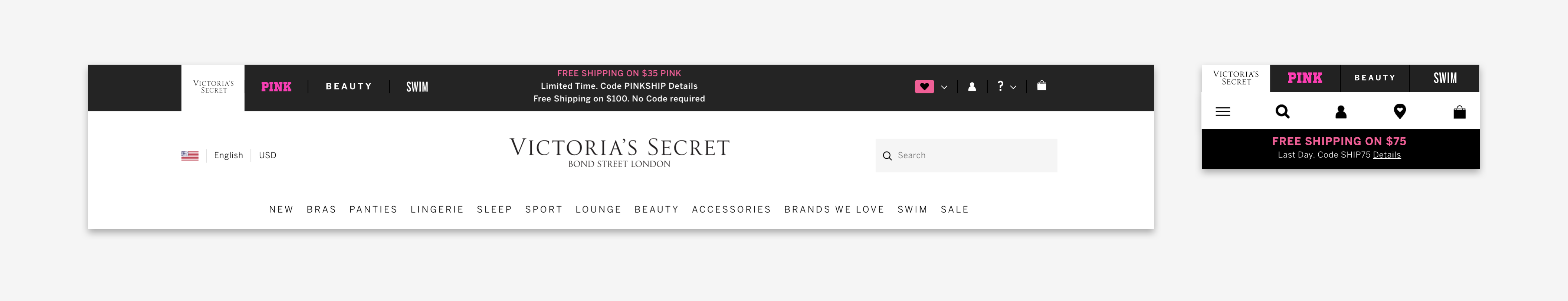
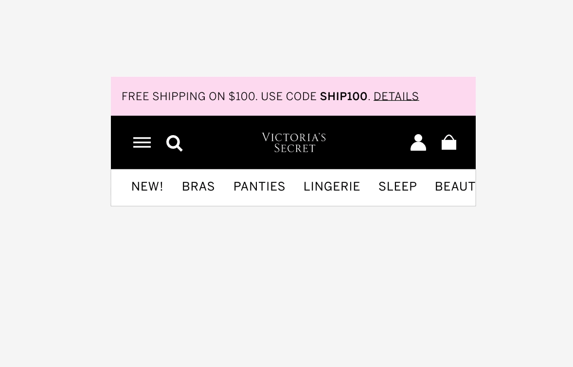
The most important part of the navigation structure at Victoria's Secret was the masthead — a monolithic component containing brand navigation, product category link and utility links. The masthead was persistent across the website, and provided the same functions throughout the customer's shopping experience. This contrasted the model of a customer's shopping journey where a given customer had different needs and exhibited specific behavior based on the type of the page they were viewing. This project was a ground up effort to redesign the navigation structure to make it simplified, responsive and configurable in order to meet customer and business needs.
Observation
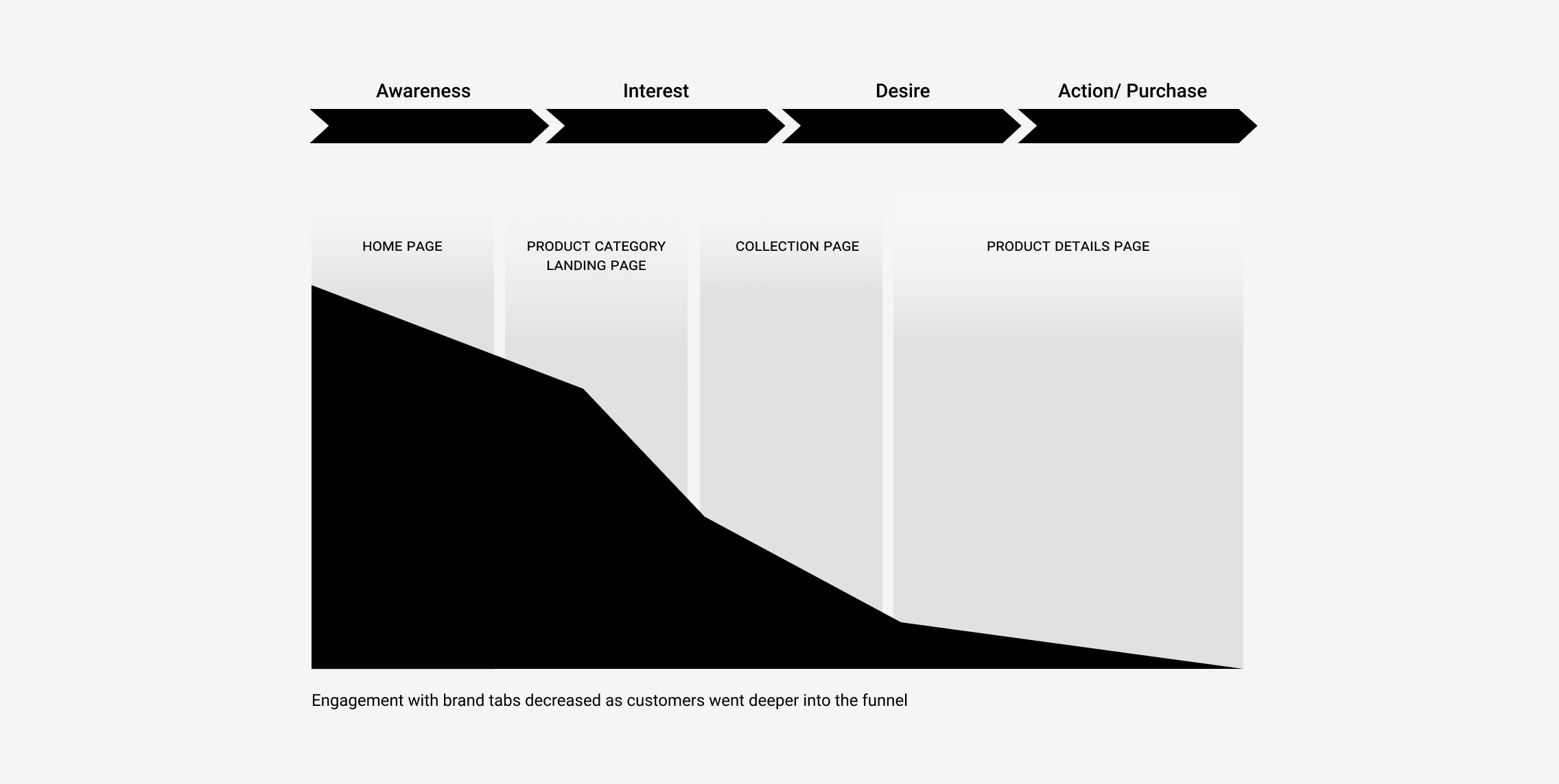
Declining usage of brand tabs
Data showed that engagement with the brand tabs decreased significantly as the customer ventured deep into the shopping funnel. The engagement for the brand tabs was highest on the home page(s), and then it declined steeply with product pages seeing less than 1% engagement. While this was expected behavior, it posed a compelling question – does it make sense to show the brand tabs in the masthead on every page?
Challenge
A static masthead
The masthead (see below) provided the same functionality throughout the website, irrespective of the page type. Previous customer research had identified that some features were more important on a specific set of pages and less important on the others. There was an opportunity to prioritize and potentially rearrange masthead functionality based on the type of the page the customer was viewing.
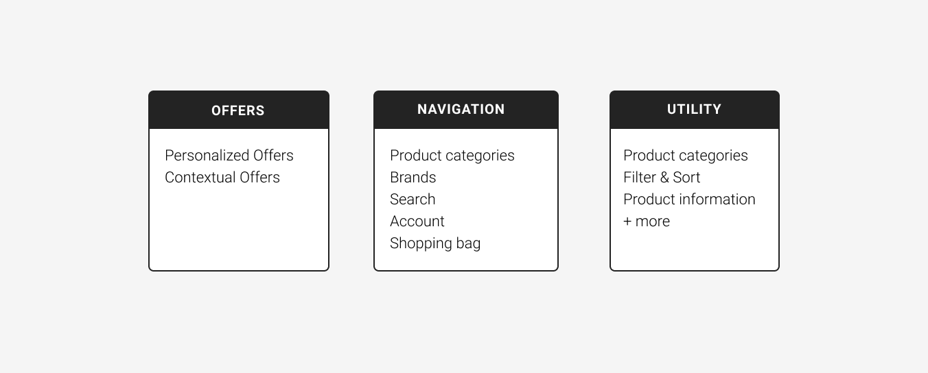
I mapped out all the masthead elements and classified them under the following groups — navigation, offer and utility. This was necessary to make sure I covered all use cases. The contextual grouping of these elements, clubbed together with usage data from analytics, informed the new navigation structure. The hypothesis for this project was as follows -
——
We believe that a modular and dynamic masthead, which provides relevant functionality to narrow down selection at each step of the customer journey, will enable our customers to more easily navigate the broad assortment of products.
——
Introducing the Modular Masthead
The modular masthead is a novel system where each module serves a unique purpose. The underlying structure is governed by a set of rules which allows it to understand and adapt to customer needs, while being highly customizable by brand partners. The key features of this system are as follows -
- Segmented – builds up on each individual module's potential
- Modular – allows higher degree of freedom while setting up navigation
- Flexible – adapts to customers' needs and improves their shopping experience
- Responsive – respects device widths and constraints

The composition
The modular masthead is broken down into three main components - offers module, navigation module and utility module. The offers module contains the sitewide offer(s), with a potential to allow multiple offers to be displayed in the space. The navigation module contains the brand logo, the hamburger menu and auxiliary links such as account, search and shopping bag. The utility module is a place for page specific utilities such as sticky categories on home and landing pages, sticky filters for collection pages and product information on product pages. The utility space was created to add page specific functionality to fulfill the customer needs.
Key Features
Configurable modules
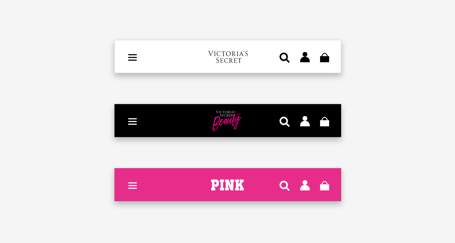
Since the modular masthead was to be used across all 4 brands, it was necessary to make the components configurable. This would open up the possibility to have brand expression while providing the vital navigation related functionality. Brand partners could potentially customize background color, text color and font styling as per their needs.
Key Features
Stackable modules
A novel feature of this system was that the modules could be stacked in more than a single configuration. The stackable nature of the modules would allow brand partners to set up different combinations of modules to fulfill customer needs. For example, research indicated that it was not important from a customer perspective to view offers when they were browsing a collection page or looking at products on a product page. With the modular masthead, the offers could be displayed throughout the website but could be hidden for collection and product pages.
Key Features
Responsive modules
Historically, the masthead has proved to be a blocker in creating a responsive web experience at Victoria's Secret. Simplifying the masthead structure would enable individual modules to be responsive to different browser widths. This was a crucial first step in the direction of creating a consistent web experience across all devices.

To summarize...
The modular masthead is a forward–looking concept for the redesign of the current website navigation. This concept is meant to be a Northstar that informs the explorations for future enhancements. This project has been broken down into multiple smaller projects that are currently in the works. The goal is to build and test each module before putting them together as one single structure. The offers module was developed and is currently live on the website with more improvements coming soon.
