Reducing cart abandonment at Victoria's Secret
Increased Orders and recovered lost revenue by designing and shipping a cart reminder feature
- Goal: To reduce cart abandonment and improve conversion
- What I did: Sketching, prototyping, A/B testing and analyzing data
- Duration: July 2019 - October 2019
Internal research done over the past few years validated the industry-wide hypothesis that the shopping experience is non-linear. We had observed that a purchase would happen over multiple visits by the customer. There was no single reason behind this; it was simply a result of the culmination of various factors largely related to customer behavior. There was an opportunity to understand this behavior and improve conversion.
CHALLENGE
High cart abandonment rate
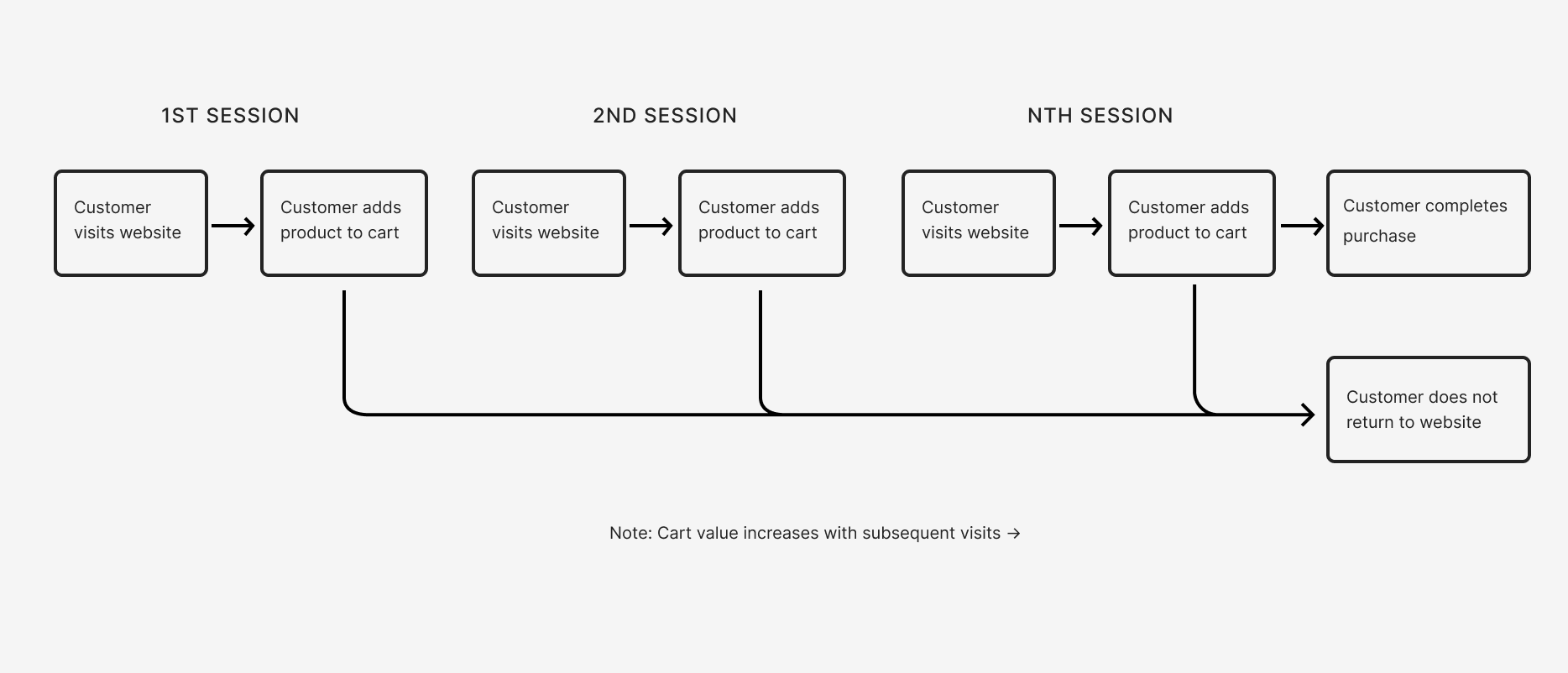
We observed that customers typically curated their cart over several browsing sessions. This peculiar behavior led to cart abandonment scenarios where a customer added items to their cart but did not complete the purchase in that session, leading to a loss in revenue from the business' perspective. Coupons sent to incentivize the purchase also reduced the profit margin. Items left in the cart for a prolonged period of time also risked becoming sold out/ not available leading to frustrations at the customer's end.
Research
Understanding customer types
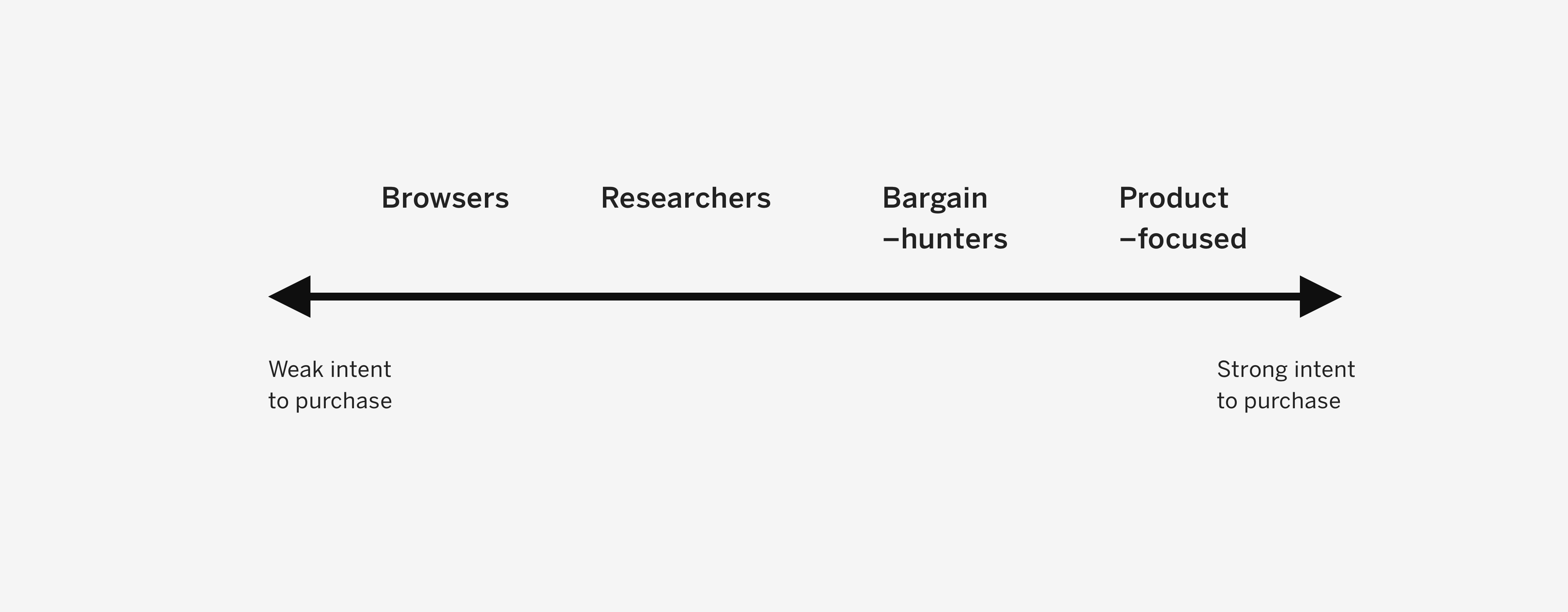
In order to design a functionality that delivers the maximum value, it was crucial to understand our target audience. Previous research had shown that there were 4 kinds of customers shopping with us. These were very similar to the 5 shopper types put together by the Nielsen Norman Group. These 4 types had distinct behaviors as shown below
- Browsers: leisure shoppers who visit websites for checking new products or for inspiration
- Researchers: shoppers who carefully compare products, prices over multiple sessions
- Bargain–hunters: shoppers who are looking for good deals
- Product-focused: shoppers who know exactly what they want to buy
Combing through multiple qualitative research studies helped me understand the correlation between customer type and intent to purchase. The image below shows customer types arranged on a scale showing intent to purchase.
Research
Identifying the target audience
Checking analytics and comparing these types against visitor behavior, we found that the majority of our customers were either Browsers, Researchers or Bargain-hunters, with Product-focused customers representing a small set of daily visitors.
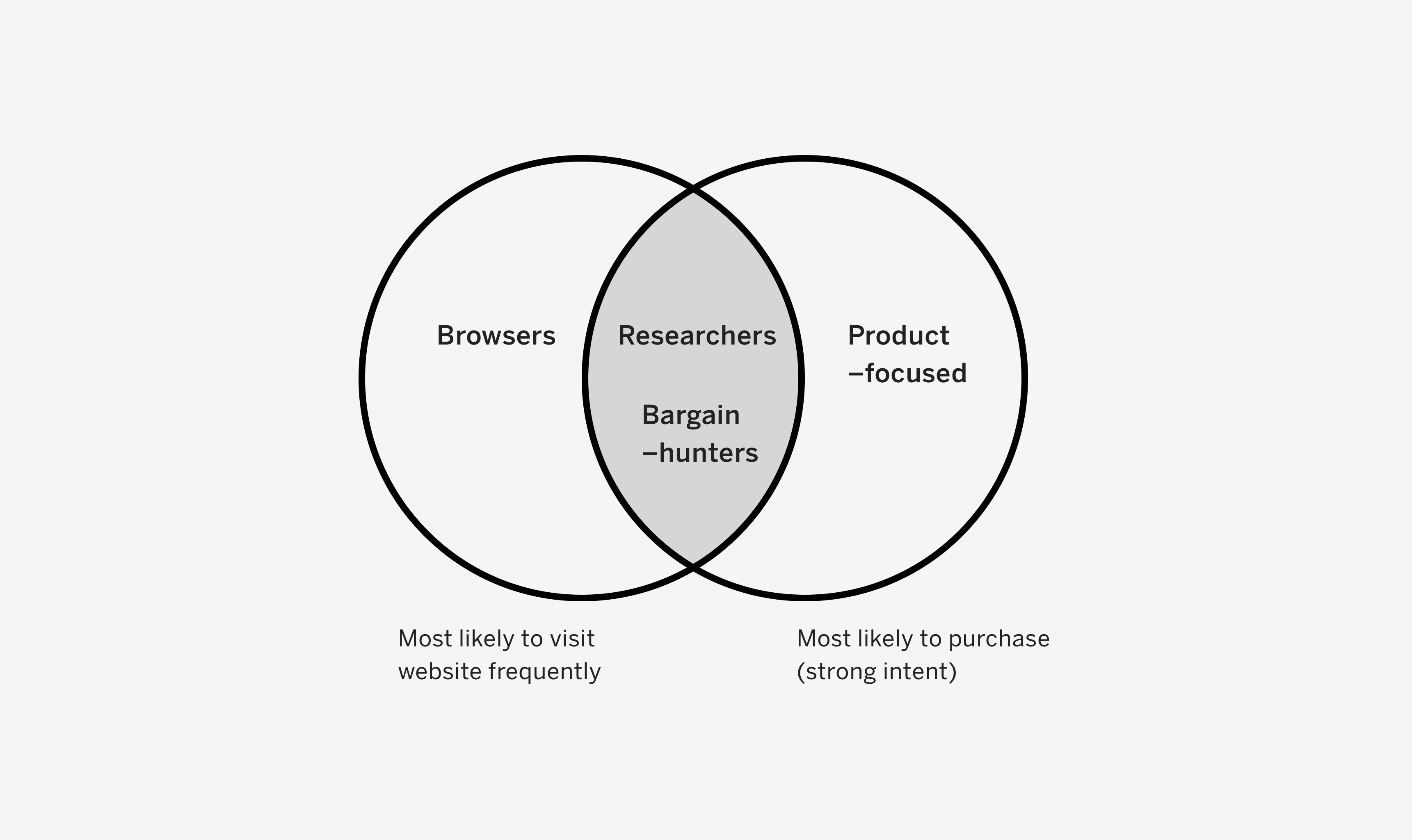
We can clearly see that the Browsers' intent to purchase isn't as high as the other three types of customers. In other words, Browsers were not contributing much to the revenue earned from online sales. Combining this with the fact that Product-focused customers represented a minority of our daily visitors, it became evident that designing a solution that catered towards Researchers and Bargain-hunters would deliver the maximum value and increase conversion.
Design
Design hypothesis
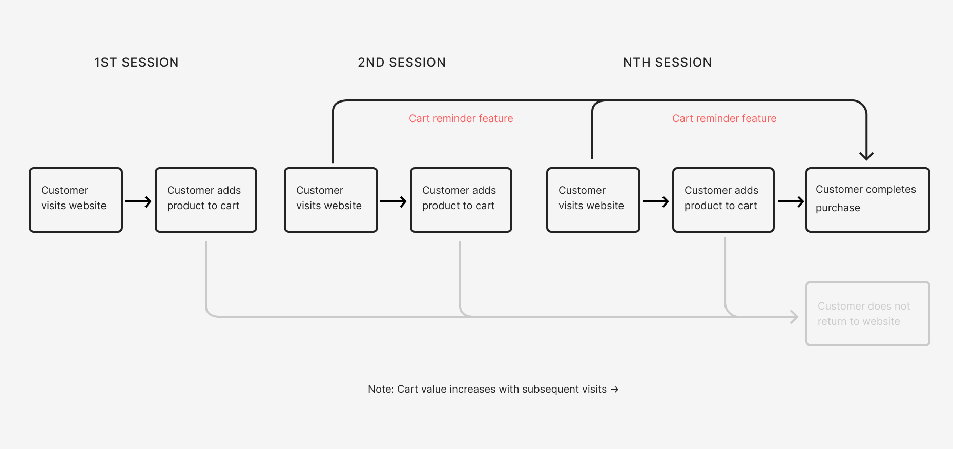
There was a potential to nudge the customer to complete their purchase as they visited the website in a new session. It was crucial that the customers were reminded on the very first page as they landed on the website to prevent losing them. With this in mind, I came up with the following hypothesis -
——
We believe that notifying customers about lingering products in their cart, will enable them to get reminded about products they wish to buy and nudge them to purchase. We will know this is true when we see an increase in Orders.
——
Design
Initial explorations
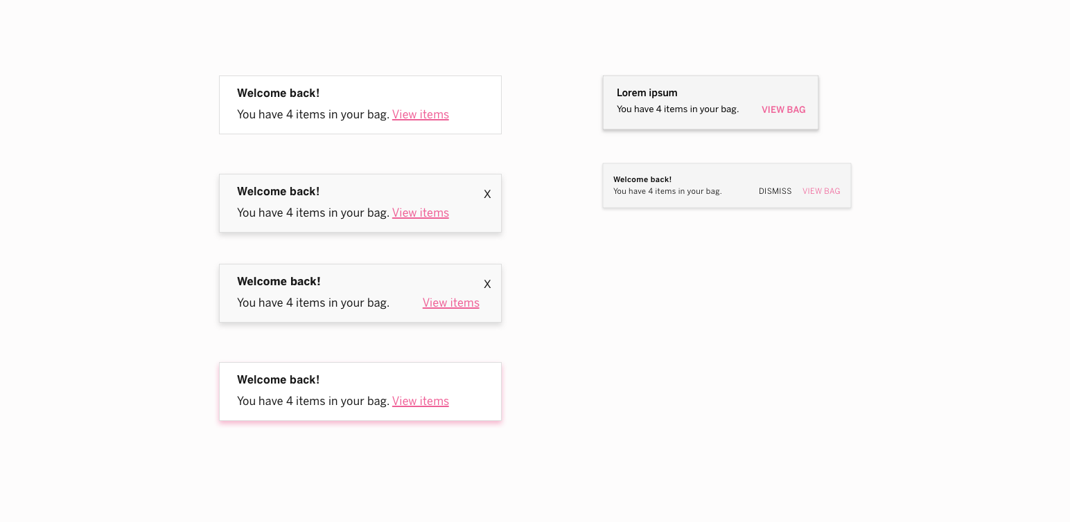
I explored a range of design solutions varying in fidelity, flexibility and functionality. A simple solution was to remind customers about items in their cart via an inline message. This message was intended to live in the form of a banner among the content but it also risked being overlooked by the customer. Another solution explored how we could show the actual products in any customer's cart. This solution provided the highest level of fidelity but it also required heavy backend integration for showing the exact product and swatch the customer had added to cart. A third solution was displaying a notification with an ephemeral nature such as a toast.

An advantage of the toast was that it appeared on top of the content and thus it could work on any page the customer viewed. It also provided a lot of flexibility in implementation — the toast could either auto-dimiss or it could be dismissed by clicking/ tapping on a button, it could appear from the top or the bottom, etc. With all of these qualities, the toast emerged as a lean and flexible solution that could serve as the building block of a robust experience.
Design
Ironing out the details
For questions that could not be answered because of lack of data, we decided to approach them with a test-and-learn strategy. For example, when it came to deciding if the toast should dismiss after a customer intitated an action or if it should dismiss automatically, we decided to test both, one at a time, and then compare engagement. Since we were introducing new functionality, we wanted to cause minimum distraction. So we decided to roll with the auto dimiss variant with the plan to test a persistent toast, if engagement was low.
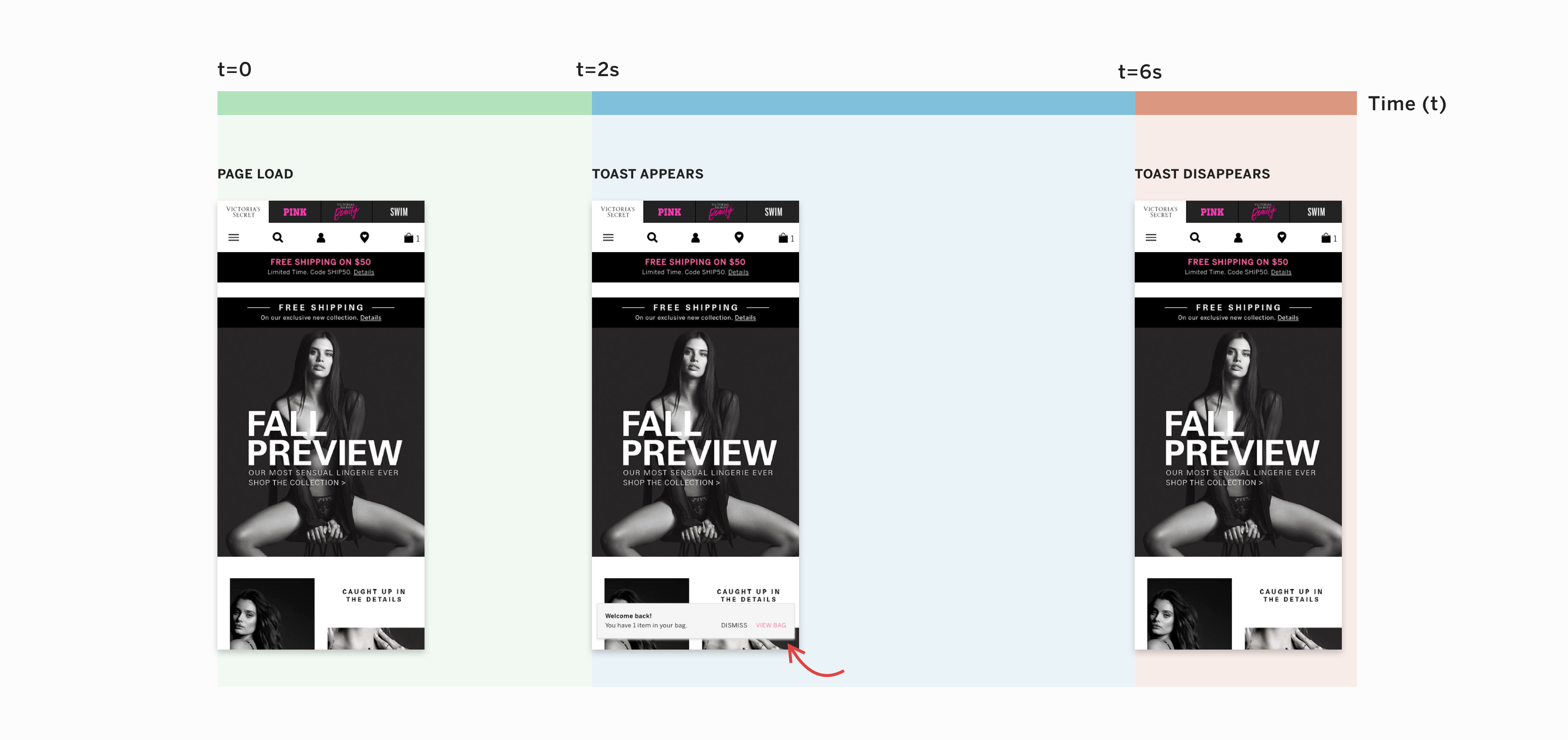
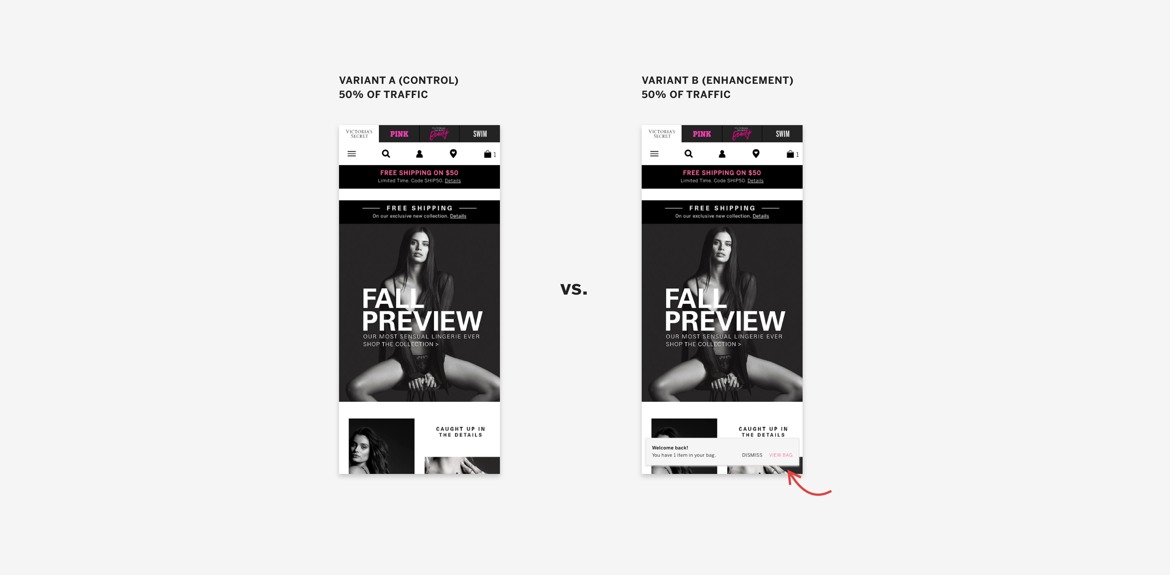
We had to find an optimal way of capturing the customers' attention without distracting them or disturbing their flow. For this reason, I decided to make the toast slide in, after the page had finished loading. The hypothesis was that the slight movement caused by the toast would catch a customer's eye. The toast would then last on the screen for a total duration of 4 seconds. This timing was established after referring to WCAG best practices and ensuring that screen readers could parse through the toast contents in that duration. These parameters were subject to change as we tested the toast experience.
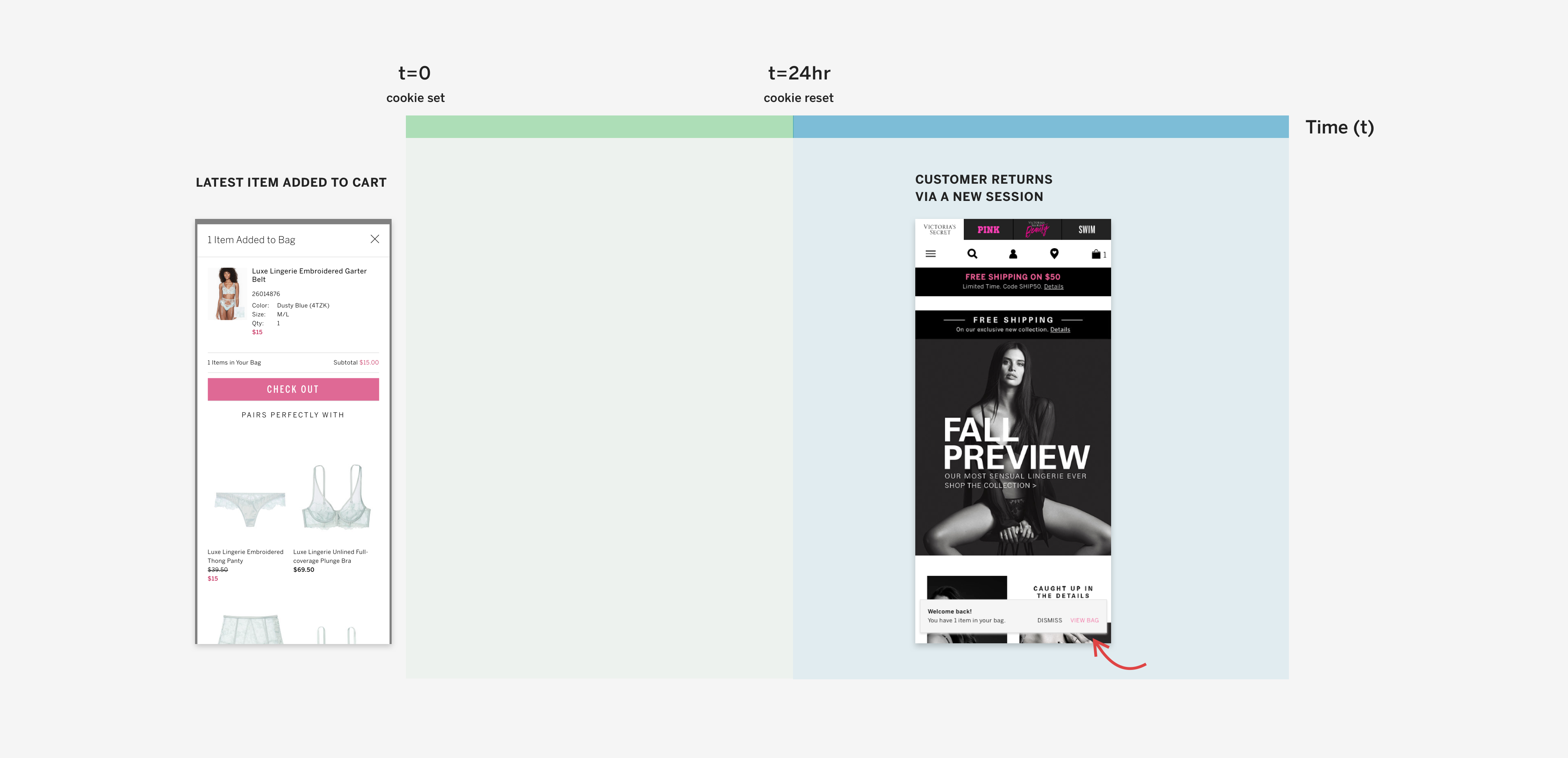
The next question we set out to answer was - how frequently should the toast be displayed? We took a look at our analytics dashboard and found that most customers returned to the website in about 24-36 hours. This seemed like a good opportunity to capitalize on – remind customers about lingering items in their cart when they return via a new session. Thus, we decided to display the toast in every session that was initiated after a minimum of 24 hours from the latest session.
Prototyping
Putting it all together
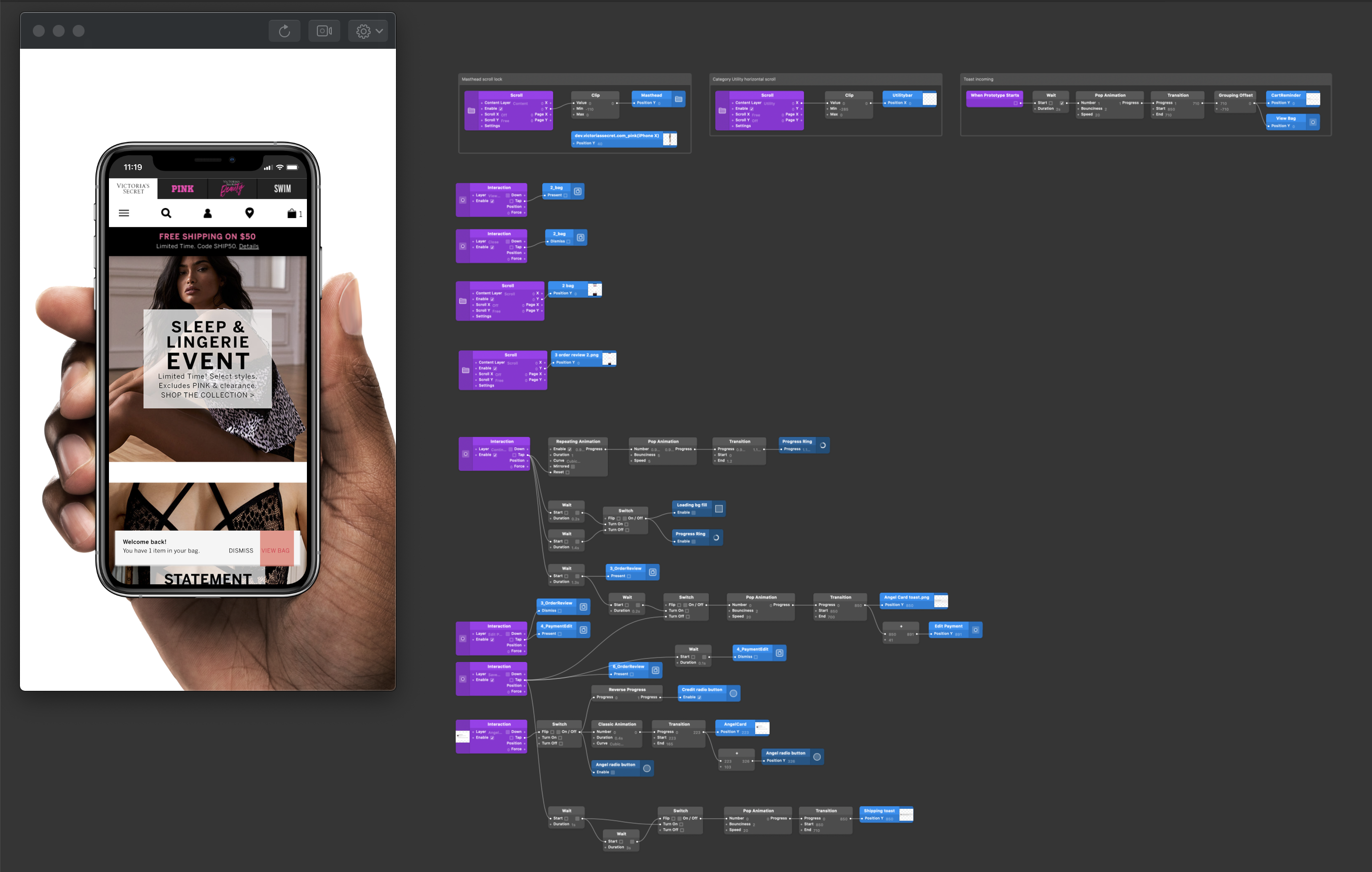
At this point, it was necessary to prototype the interactions to get a feel of the experience. I brought all of the design decisions together and created a prototype in Origami Studio. This was a great way to validate the static mockups and ensure that the touch targets were proper and the entry/ exit animations felt right. It also gave me an opportunity to test the experience in various scenarios such as one handed usage and multi-tasking/ context switching.
A/B Testing
Testing the toast
The cart reminder toast was tested across desktop, tablet, mobile and the VS app platforms using a 50-50 traffic split in March 2020. The two variants were labeled as enhancement (with toast) and control (without toast). The success of this test was measured by monitoring two primary metrics- Orders and Revenue. A few secondary metrics we planned to analyze were Units per Transaction (UPT), Revenue per Visitor and Average Order Size (AOS). Capturing secondary metrics was important to validate alternative hypotheses and get granular data.
A/B Testing
Impact
The toast performed well on mobile, with the enhancement variant showing an increase of 3% in Orders on mobile and 2% increase in Orders on desktop. Surprisingly, the Revenue per Visitor decreased by 4% on desktop enhancement variant as compared to the desktop control variant (without toast).
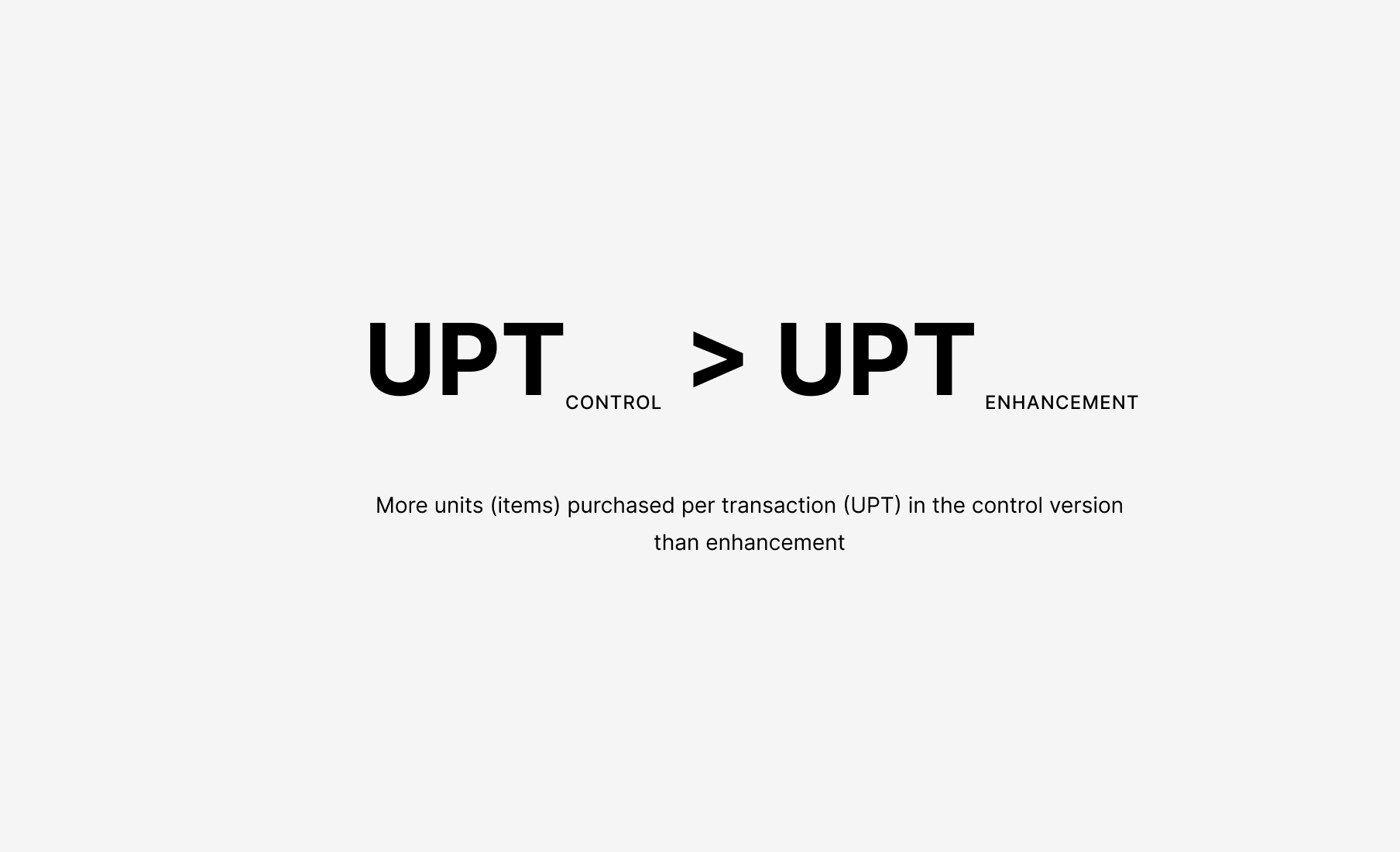
On comparing the Units Per Transaction(UPT) metric, it was clear that the average items bought in a single purchase on desktop was more in the control variant than the enhancement variant. Basically – customers were placing more orders but they were buying less items. This pointed to an alternative hypothesis that perhaps the toast was too frequent on desktop, and maybe it interrupted customers as they were building a high-value cart. This premature interruption likely pushed customers to check out early with fewer items in their cart. We decided to validate this hypothesis in a subsequent round of A/B testing.
Next Steps
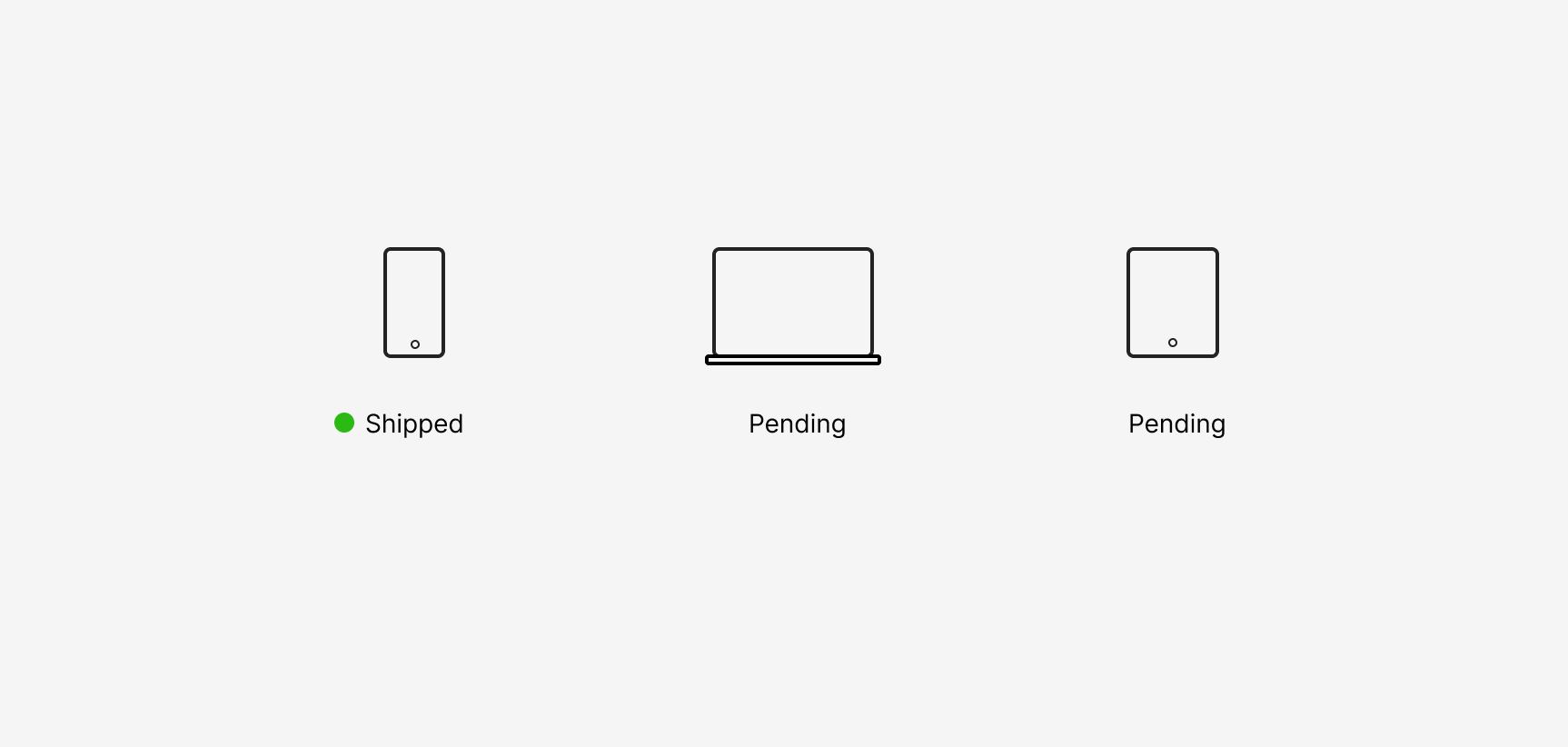
Since the toast performed well on mobile, we released the enhancement variant to 100% of the traffic. I took away the findings of the test and the alternative hypotheses back to the drawing board. My main goal now was to make small tweaks to the implementation of the toast and tailor the experience for each platform (desktop, tablet, mobile). These changes would be put through an A/B test again to enable us to learn and incrementally inch towards delivering the best experience. As of today, I am currently working on designing the next set of improvements for the toast functionality.
Reflection
This was honestly a fun project to work on, given the limited resources we operated with. While the solution delivered results and achieved the objective, I personally think that there is scope for improving this experience. Here are a few thoughts on the shortcomings of this solution and how I would improve the experience if I had additional time and resources -
- Since this solution relies on cookies which are browser and device specific, this experience does not work as intended when a customer switches between devices or browsers.
- The experience could be made better by showing the toast when a customer's cart has reached a certain threshold (value). This would prevent customers from checking out too early thus increasing the Average Order Value.
- Building on my previous point, we could incentivize customers to check out by also notifying them of the available offers they qualify for, given their cart value and contents.